A north-facing kitchen is one of the most common design challenges in London and the South East. Many Victorian and Edwardian terraced houses have rear-facing kitchens that receive limited direct sunlight, particularly during the winter months. The light in these rooms is cool, flat, and consistent rather than warm and directional, and it has a significant effect on how colour reads on cabinet surfaces.
Getting colour right in a north-facing kitchen requires understanding how different tones behave in low natural light, and it is one area where off-the-shelf colour choices frequently go wrong. At Higham Furniture, our bespoke paint palette, developed in partnership with Little Greene Paint Company, includes a range of tones that have been selected and tested specifically for how they perform in the kinds of spaces our London clients live in.
Why Light Direction Changes How Colour Looks
Colour is not an absolute property of a surface. It is the result of light interacting with pigment, and the quality of that light changes throughout the day and across different orientations. South-facing rooms receive warm, direct sunlight that enriches both warm and cool tones. North-facing rooms receive indirect, cool light that amplifies cool undertones and can make warm tones appear flat or muddy.
This is why a colour that looks beautiful in a south-facing showroom may feel cold and lifeless when applied to cabinets in a north-facing kitchen. The showroom is lit differently. The colour is the same; the light is not.
Colours That Work Well in North-Facing Kitchens
There are two broad approaches that tend to work well in north-facing kitchens, and they work for different reasons.
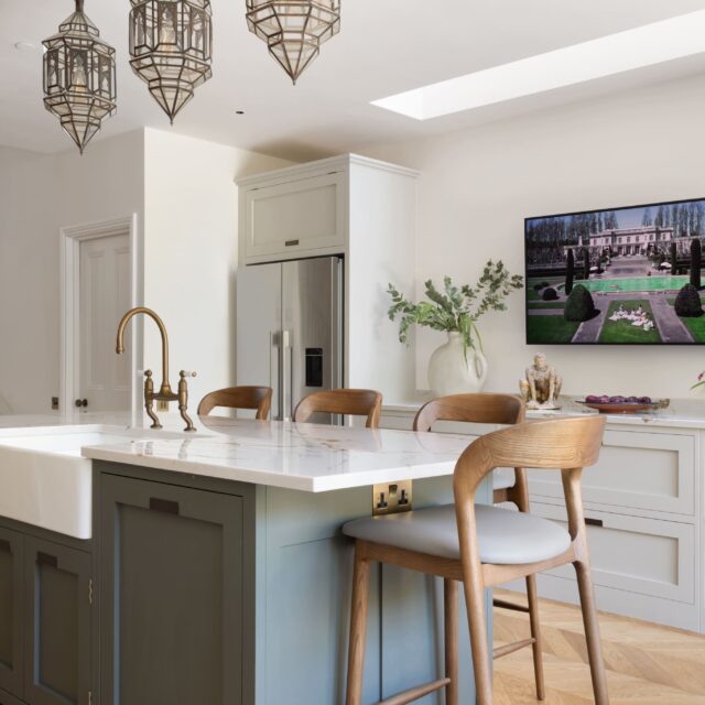
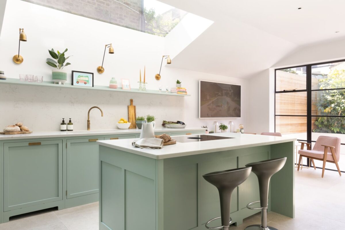
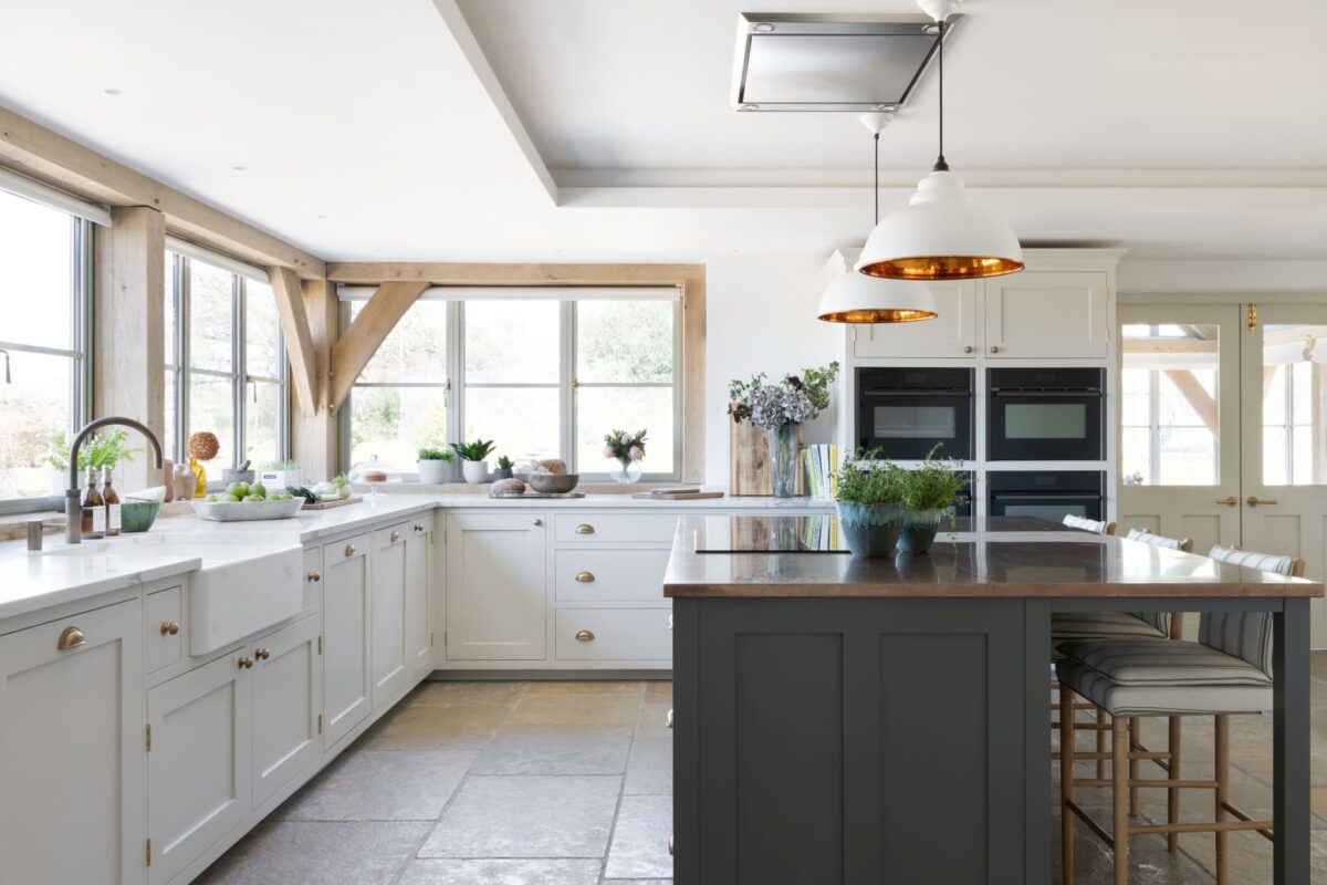
The first approach is to lean into the cool quality of the light rather than fighting it. Cool, chalky whites and pale greys, tones with blue or grey undertones rather than yellow or pink ones, sit comfortably in north-facing light because they are tonally aligned with it. They neither fight the light quality nor are diminished by it. Higham’s palette includes several tones in this register that perform consistently well in low-light conditions.
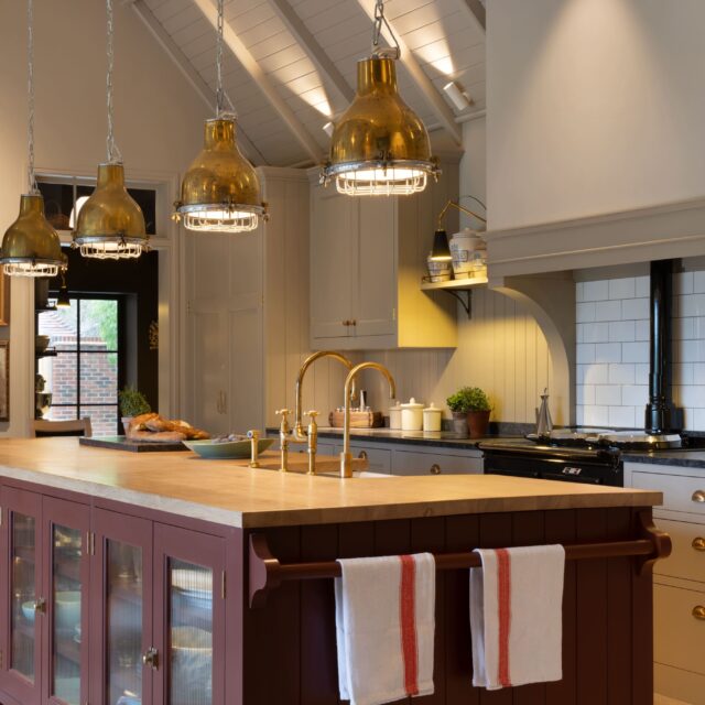
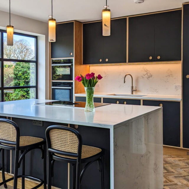
The second approach is to use deep, saturated tones that are strong enough to hold their character regardless of light conditions. Forest greens, deep navies, and warm charcoals retain their depth and presence even in flat, cool light where pale warm tones lose their appeal. A deep tone in a north-facing kitchen can create a cocooning quality that works well in the space rather than trying to compensate for a perceived lack of light.
What generally does not work in north-facing kitchens is the middle ground: warm mid-tones like soft creams, pale yellows, and greige shades that are dependent on warm light to look their best. In cool north light these tones can appear dingy, yellowish, or flat in a way that neither the palest nor the deepest options do. For more on how style and colour choices interact with period architecture, see our guide to the best kitchen styles for Victorian houses.
The Role of Artificial Lighting
Artificial lighting has a significant effect on how kitchen cabinet colours read in the evening and during the winter months when natural light is limited. The colour temperature of light fittings, measured in Kelvins, affects how warm or cool the light source is.
Warm white light (2700K to 3000K) enriches warm tones and softens cool ones. Cool white or daylight bulbs (4000K to 5000K) preserve cool tones accurately and can make warm tones look washed out. In a north-facing kitchen, warm white task lighting can compensate for the cool quality of natural light and make a wider range of cabinet colours viable.
This is worth discussing with your designer before finalising a colour choice, because the light fittings specified for the kitchen will affect how the colour reads for much of the year.
Testing Colour Before You Commit
The most reliable way to assess how a colour will perform in your specific kitchen is to test it in your specific kitchen. Paint samples applied to a large board and placed against the cabinets in different light conditions across several days give a much more accurate reading than a small paint chip or a showroom sample viewed in different light.
At Higham Furniture, the colour selection process involves testing samples in the actual space before any decision is finalised. The palette developed with Little Greene has been informed by this process across hundreds of completed projects in London and the South East.
Starting Your Kitchen Design with Higham
If you are planning a kitchen in a north-facing room and want to discuss colour choices specific to your space, the process at Higham begins with a private 30-minute design call. Home visits are available across London and the South East.
Book a design call here to begin the conversation.
Frequently Asked Questions
What colours work best in a north-facing kitchen?
Cool chalky whites and pale greys with blue or grey undertones work well because they align with the cool quality of north light rather than fighting it. Deep saturated tones, forest greens, navies, and charcoals, also perform consistently well because they hold their depth regardless of light conditions. Warm mid-tones like pale creams and greige shades tend to look flat or dull in north-facing light.
Should I avoid white cabinets in a north-facing kitchen?
Not necessarily, but the specific white matters. Pure whites with blue undertones and chalky off-whites with grey undertones tend to work better in north-facing kitchens than creamy or warm-tinted whites, which can appear dingy in cool light. Testing a sample in your specific room across different times of day is always the most reliable approach.
Does artificial lighting affect which cabinet colours work in a north-facing kitchen?
Yes, significantly. Warm white light (2700K to 3000K) can compensate for the cool quality of north-facing natural light and make a wider range of tones viable. The colour temperature of your task and ambient lighting should be considered alongside cabinet colour choice, not separately.
Can dark colours work in a north-facing kitchen?
Yes. Deep, saturated tones often work particularly well in north-facing kitchens because their depth and richness are not dependent on warm direct light. A deep forest green or navy in a north-facing kitchen can feel intentional and considered rather than gloomy, especially with good artificial lighting.
How do I test a kitchen cabinet colour before committing?
Apply a large paint sample, at least A3 size, to a board and place it in the kitchen at different times of day and under different lighting conditions. Assess it over several days rather than a single viewing. Small paint chips viewed in different light conditions are not a reliable guide to how a colour will read across a full run of cabinetry.
Written by the Higham Furniture design team. Higham Furniture is an award-winning cabinetmaker based in Denmead, Hampshire, with a design studio in Fulham, London. Tim Higham and his team have been designing and building bespoke handmade kitchens for discerning homeowners across London and the South East.